Project Goals: We were tasked with taking the existing logo, and completely redeveloping the brand voice for PetSafe’s consumer product packaging in all three channels, making sure to retain some brand consistency. The previous brand efforts had very little cache, as old packaging was dated and the exact same across all channels.
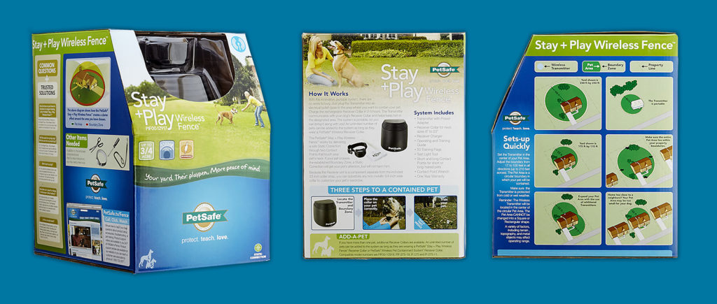
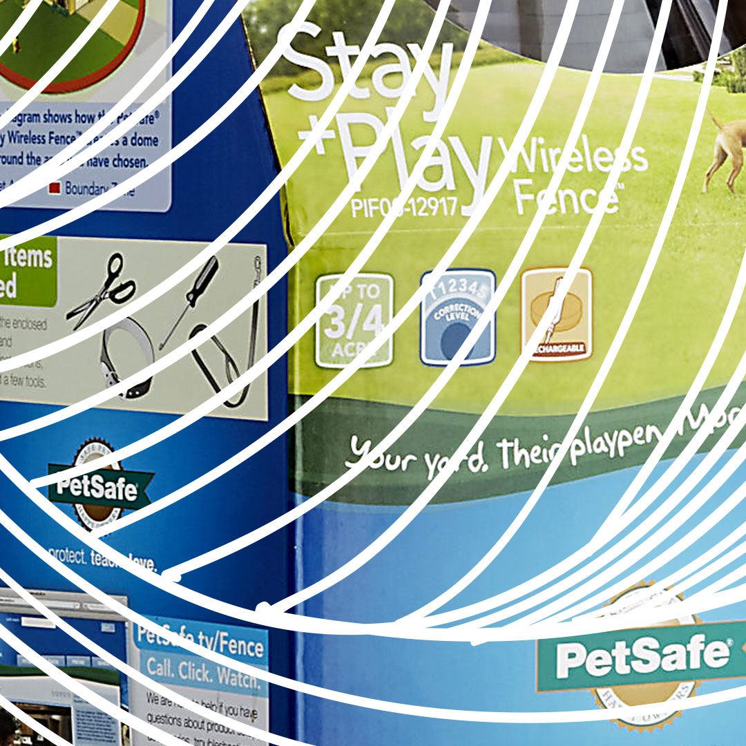
Our Solutions: We made the line between the three channels (premium pet = best; home = better; WalMart = good) very distinct, while still retaining some common elements. The premium pet channel brand was built with very positive imagery, icons to shy away from using text descriptors, more modern typography, and a cool color palette. The home channel used more natural tones that were more prevalent than the imagery, maintaining the use of common icons, and similar, modern typography. The WalMart channel used one a singular color palette, depending on the type of product, little imagery, maintaining the use of common icons, and similar, modern typography.
Results: Within a few months of the initial rebrand push, sales went up across all three channels. Buyers in the premium channel stated that the packaging finally looked like a valued product. Buyers in the home channel stated that the packaging fit better among their established brands. Buyers in the WalMart channel stated that they were happy with the packaging’s clearer messaging.